
Peston’s power trick
There has been a concerted campaign in recent weeks to convince the public that current high electricity prices are mostly a function of high gas prices. This argument is entirely incorrect. Robert Peston’s recent interview of Kemi Badenoch on his eponymous show on ITV appears to have been part of this campaign. At the start of the segment, Peston’s co-presenter Anoushka Asthana set out some data, apparently sourced from Carbon Brief, that entirely misled viewers and set out a false basis for the interview that followed. Her argument about high electricity bills was in two parts
they were not due to Net Zero policies;
instead, they were due to high wholesale costs, caused by high gas prices.
Electricity prices for steel users
Asthana used the graph in Figure 1, extracted from a UK Steel report, as evidence. She observed that the policy cost element was relatively small. However, she undermined her case by noting that the steel industry is exempt from most of the policy costs relating to Net Zero. She was therefore essentially admitting that she was highlighting a special case – most of UK industry does not enjoy the same exemptions. To put it another way, the programme showed, as evidence that ‘Net Zero is not the problem’, electricity prices for a sector that is specifically exempted from most Net Zero costs!

Figure 1: The steel price graph
As a result, there are no general lessons to be learned from the data she presented.
She went on to suggest that the major difference between the countries related to the wholesale element of the bills. However, the special circumstances of the steel industry again undermine her case – French steel operators do not purchase electricity in the open markets, but instead buy direct from nuclear power stations under a non-commercial arrangement brokered by the Government. It is grossly unfair to compare this to the open-market price quoted for the UK.
To consider the effects of Net Zero policy on industrial electricity prices, it would be necessary to consider all industries and all elements of the bill. By considering only an industry that is exempt from most of the policy costs, and only one element of bills that might affect all of industry, the ITV analysis became an irrelevance.
Retail prices
The second graph shown by ITV was a breakdown of retail electricity prices, based on the Ofgem electricity price cap data. Readers were invited to look at the recent increases, caused by increases in wholesale costs.

Figure 2: The retail prices graph
They were then shown a third graph (Figure 3), setting out the close correlation between wholesale gas and wholesale electricity prices. This arises because wholesale electricity prices are set by gas-fired power stations. The relationship, and therefore the graph, although widely misunderstood, is not particularly controversial.

Figure 3: The wholesale prices correlation graph
The combination of the (gas-driven) price increases in the last 12 months and the correlation between wholesale gas and wholesale electricity prices was then used to suggest that that gas prices, rather than Net Zero policies, are behind the rising cost of electricity.
Problems with the ITV graph
There is a series of problems with the ITV graph in Figure 2.
The x-axis is not uniform, thus overemphasising the right-hand side.
It is not corrected for inflation, which has been high in recent years, again overemphasising the recent price increases.
The impact of the 2022–23 price spike hides the trend in the non-wholesale costs.
Wholesale electricity prices are inflated by the imposition of carbon taxes – the Climate Change Levy and the Emissions Trading Scheme.
A more careful analysis
The graphs below are based on the same data as ITV (the Ofgem price cap analysis), but have uniform x-axes and are corrected for inflation. Unlike ITV, the focus is on the long-term trend, over 10 years (the full extent of the Ofgem dataset), which gives an entirely different story to that presented by ITV.
It is not clear how costs were allocated to each category in the ITV graph – different decisions are possible for some items. In the discussion below I set out a full breakdown of the items included in each category. But note in particular:
The costs of Contracts for Difference and Capacity Market subsidies, which Ofgem treats as part of wholesale cost, have been treated as what they are – namely policy costs.
The remaining balance is inflated by carbon tax costs. For the purposes of this analysis, an estimate of this uplift has been made and is disclosed separately under Policy Costs.
Bill changes over the last 10 years.
In real terms, the April 2025 price cap is £326 higher than the equivalent one in 2015. This figure can be broken down as shown in Figure 4.

Figure 4: Breakdown of the increase in electricity bills, 2015–2025
Wholesale
In this analysis, the wholesale cost is Ofgem’s ‘Direct cost’ figure, less an estimate of the carbon tax costs, which have been reallocated to Policy costs. The increase over the last ten years (caused by gas) is thus only 14% of the overall increase. Figure 5 shows how this element of the bill has changed over the last 10 years.

Figure 6: Direct cost of electricity in bills
There are three distinct periods, which correspond to the equivalent trends in gas prices – the long period of stability from 2015 to 2021, the spike during the energy price crisis, and then the return to something close to normality at the start of 2023, followed by a rise in the last 12 months, mostly because of cold weather and the EU requirement to refill gas storage ahead of the winter, which pushed up gas market prices.
Note however, the wholesale element is now only £45 (in real terms) above where it was in 2019, before the Ukraine war.
Policy costs
The 10-year real-terms increase in policy costs of £188 is broken down as follows.
| £ | |
|---|---|
| Capacity market | 26 |
| Renewables subsidies | 83 |
| Carbon taxes | 39 |
| Insulation schemes | 11 |
| Social schemes | 9 |
| Smart meters | 20 |
All are closely related to Net Zero policies and all have increased over the last ten years. Clearly the bulk of the increase is due to Net Zero policies. The underlying trends can be seen in Figure 6. The dip in subsidies in 2022–23 is due to CfDs paying back to suppliers when wholesale market prices spiked.

Figure 6: Policy cost additions to electricity bills
Network costs
ITV did not consider changes in network costs at all, although a long-term increase – £49 in real terms – is obvious from their graph. The breakdown is shown below.
| £ | |
|---|---|
| Transmission | 17 |
| Distribution | 6 |
| Balancing | 26 |
The rise in costs is also almost all due to Net Zero. The trends can be seen In Figure 7. The Balancing increase is mostly due to increases in so-called constraints – paying windfarms to switch off and then paying a gas-fired power station to switch on. The cost has risen steadily as more and more windfarms have been added to the grid in Scotland, where they are likely to be constrained. Some of the apparent spike during the energy price crisis is due to it becoming more expensive to pay gas-fired power stations to switch on.
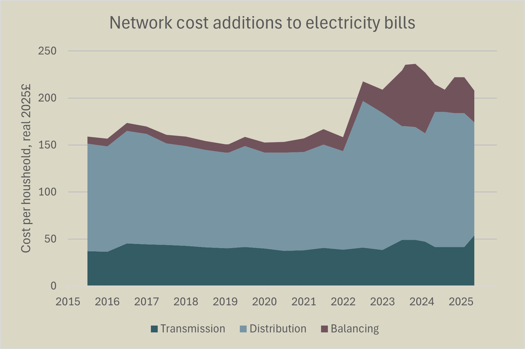
Figure 7: Network cost additions to electricity bills
Transmission costs have increased due to the need to strengthen grids for Net Zero.
Conclusion
Electricity bills are higher than ten years ago because of the effect of Net Zero – in particular direct levies on bills to fund renewables subsidies, and higher balancing costs resulting from the wider use of renewables on the grid. ITV’s analysis of the situation was therefore based on an entirely false premise.